Thursday, August 6, 2015

acpw

First I need to note that ABIO was chart number 3 of 600 on my list. That's a bookmark, in case I need to re-start my charting program. Now I seem to remember there was another interesting chart a few charts later. The truth is, I should be sorting all the charts into separate lists, or books, as I do this writing, so I won't have to go over the list again and again. Numbers 1 and 2 were both steadily down for a year, and I discussed how I want to handle those. But, I'm impatient. Let's see what's next, and maybe before I go further than that I'll see what I can do about the other chart types.


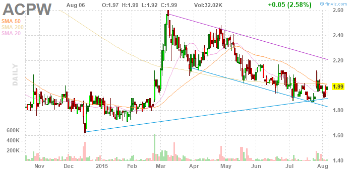
The "pattern" recorded here is the dip to $1.60 in December, which was followed by an instant recovery, and then something shaped like a kind of hook, maybe, which I see again and again, that hook shape ... and, in this instance, there followed a somewhat notable rally.

As usual there are assorted things we could look at. One would be asking how we could have know where the rally was going to top out. There are places to look for clues, in the past, but also clues can develop. A rally of this sort produces broad green bars. Well, the green color is a function of the type of chart, but these are days when the price started low and ended considerably higher, and then, if we look at these examples, most of the bar is above the previous day's bar. Furthermore, there were three such bars made before the price reached $2.40, and the bar that crossed that line was of the same type, but in the case of the first three examples, the next bar stayed high up relative to the big green bar, while, in the case of the final example the next bar sent a long tail all the way down to almost the bottom of the big green bar. That turned out to signal the top.

I see this making a second, bigger hook, now, so I'm predicting a rally to something like $3, in two or three months. You might note the theme that's developing, which is the notion that small patterns are followed by larger images of themselves. You might also note that this chart only predicts a 50% gain, where ABIO predicted a 100% gain, speaking now about what I think is going to happen during the rest of 2015. Hmm. Maybe I'm selling the pattern short. Measuring off the hook, the rally in February carried quite far. Well, we'll see. I feel silly, launching right into predictions this way, but I can't help myself. By the way, this is number 6 out of 600.

11

I ended up making a prediction. That made me very anxious. Well, maybe I didn't overtly make a prediction. The thing is, I got excited. I want so much to buy some shares, right now! What is the proper way to handle this?

Well, for one thing, I'm lucky. I don't have any cash to invest. I could sell some shares - I own stocks worth several thousand dollars - but they are all stocks I want to hold on to. I'm excited, but, in effect, not tempted.

I did suggest, in fairly explicit terms, not buying these stocks. Well, I said not to put a lot of money into them. If I were putting money into ABIO, I would be planning to invest one hundred dollars. The larger plan would be to invest $100 in each of quite a number of stocks. I want to emphasize that this is not a very practical plan. You would need to keep an eye on each of those stocks, which would definitely be a chore. Ideally, you would develop some sort of system for tracking your positions. Writing about this is making me think about these things, which is interesting. I think I might write about that more.

ABIO has been making a series of rising spikes. There were three in February alone, one to two weeks from each other, then one in March and one a month later in April, and then one three months later in July, so the time elapsed between them is growing. The shape of the July spike and its surrounding lower prices is consistent with the shapes of the other spikes. The whole pattern makes me expect more off the same kind of thing. Maybe in 9 months ABIO will make another top a bit above the level of the July top. Also, in March ABIO made a top, then pulled back in a set of small waves, steeply descending, then made a bigger wave, and another low price, and even after that it made a top and pulled back for a time, and to a fairly low level, before completing the rally to the April top. Maybe something similar is developing now. Maybe - here's my guess - a price of as low as 90 cents is coming, and then a rally to something like $1.25, then more low prices, then a rally to $1.40, then low prices again, and this would now be, say, six months from now, and then a rally to somewhere near two dollars a share.

This looks very convincing. I feel quite confident about it. And yet, I would be very wary of putting more than a little money in. Let's see. Now, if you are calculating the return you can expect from a trade, you calculate the gross return, and then you subtract the commission. If I could buy 100 shares at 90 cents, and for ninety dollars plus $10 commission ($8, really), and then sell at $1.25, my profit would end up being $15, which is, of course, very small potatoes, although it's 15%, and I would achieve that in a matter of days, or weeks at most, so it's actually a good rate of return.

Now, listen, if I were to put in one thousand dollars, or, let's say, $900, then my return would be $325, after expenses, and that's a 30% return, so the commission has a big effect on the smaller trade. But putting in $1000 would make me very nervous, or it would at least be against my principles. I can't really say more about what to do or not do, here. Let's try to look at more examples, and see where it takes us.

chart 1


So, ABIO tumbled downward, like a bubbling brook, into December 2014, and then it splashed upward nearly 100% in three big days. Then it "returned to its December bottom" at a more or less measured rate by late January. That's the pattern, and from the bottom price of .70 it doubled within six months.

Really, there are numbers of spiky tops in this chart. I feel like something could be learned from each of them. Try comparing the pattern in March to the larger pattern that's developing now, the pattern of June and July.

9

And even if the charts I post do make a compelling case for trading chart patterns, you should be wary. Think about it this way: you may see evidence that certain pattern predict rather rapid doubles. If that's in fact true, then you should be able to start with quite a small amount invested, really, an inconsequential amount, a frivolous amount, and soon build it into a massive fortune, or a small fortune, at any rate. You should not, this is to say, think that success with trading chart patterns depends on any kind of substantial starting capital. Quite the opposite. And you very probably should pointedly not start with a large amount of money, because that would set you up for a possible big loss.

It's true that, if the system doesn't work very well, you will not make money with a small amount invested. The charts I post might give some indication as to whether it's worth your trouble to put a small amount of money into trading. Even if this evidence ends up looking quite good, I rather hope you will not rely on it entirely. One way to diversify is to use more than one system, and the traditional approach - you could call it that - is described in certain places, and, really, in many places, and I'll discuss those when I get around to posting on investing. If you're not sure, put most of your savings into insured accounts. That's not really where you should keep your money, but safety is of paramount importance. Safety First!

8

By "now" I mean shortly. First I want to say that the charts I'm posting here are "fixed" charts from a certain point in time, in short, an actual historical record, even though they come from a web site that specializes in showing people "the latest" on the stock market. It so happens that that site, Finviz.com, does offer these fixed charts, for publication in blogs and on web pages. These are "embeddable" charts, so they are "served by" Finviz, when you load a post. I think it's pretty amazing that Finviz offers that service. I don't quite know what to say. I'm not really a Finviz customer. Pretty much I just use their site to get these charts. They offer a variety of tools, but I don't quite know what to make of them. If Finviz is listening, perhaps that would interest them. Anyway, I'm grateful they let me publish the charts. Hopefully they'll continue to do so.

The other thing is, my disclaimer. You may have heard the truism that most traders loose money. I'm basically living proof of that. I'm not telling you how to trade, here, I'm trying to figure it out myself, and I'm showing you how I'm going about it. It's true, I've had some successes, recently, but I'm not getting the kind of reliable results that would define overall success. Really, unless the charts I post going forward make quite a compelling case, you might want to avoid trading. It does seem to me that investing in stocks is important for, say, a working person who wants to retire under prosperous circumstances. I've seen some convincing advice on how to do that. I suppose I should say something about that, but I'm impatient to look at charts. Look for a post some time later that I'll title "investing".

7

My thought is that there are charts which show what could be called a more complete kind of pattern followed by an event. In fact, I described such a pattern earlier, and the reason I described that kind of pattern was that I know one of the charts near the top of my list illustrates just such a pattern. Shortly, I'm going to post that chart. I need to discuss its meaning, though, and I'll try to do that before I start posting charts.

Basically, looking at that chart, I see a distinctive pattern, followed by an attractive kind of action. Now it's possible the attractiveness of the following action is affecting my mind - prices went up nicely, and I want to see patterns that are followed by just that kind of event - but still, I feel I would have been interested in the pattern that developed before that rally, if I had been looking at it as it developed.

The thing is, even if the pattern that preceded the rally was in fact distinct and identifiable, the one example proves nothing. What might provide some useful evidence is if I can identify a number of examples of that kind of pattern, each followed in the chart by subsequent events.

Now I'm going to start posting charts, and we'll see how it goes.

6

Here, though, on this blog, my purpose is a bit different, and it relies on a third type of chart I see fairly often. This kind of chart shows a pattern of some sort, and it also shows some event or sequence of events that occurred after that pattern formed. Let me define my terms. A steady one year decline is a kind of pattern, but that pattern by definition cannot be followed by anything on a one year chart. A steady six or nine month decline, it is true, could be followed by something, by an event, and that event could be visible on a one year chart, together with the six or nine month decline.

This means I might be able to collect some examples of steady declines followed by some kind of event. A steady decline could arguably be followed by one of three types of events: an advance, a decline, or a period of sideways action. I might be able to collect, here, examples of steady declines followed by some or all of those.

Realistically, though, it's probably not that simple. I'm likely to find all sorts of things after steady declines, and then there's this: as events develop after a steady decline, it could become increasingly difficult to say, with confidence, that a given pattern, which occupies the first half or two thirds of a chart, would have been visibly a steady decline, on a one year chart.

5

I will also tell you that I inevitably want to buy the stock, when I see one of these steady one year declines. It's just an emotional reaction I have to those charts. It's not that I actually know that a stock with that kind of one year chart is a good buy. I don't. I do suspect those stocks are going to go up, and go up quite rapidly, all the way to their one year highs, and perhaps beyond ... but I really don't know that. I really don't actually know what they are going to do.

That's the thing. The chart shows me a pattern that gives me a strong "feeling", but it doesn't show me anything that would confirm that feeling. It shows me a pattern I like, but it doesn't show me "what happened next".

One thing I could do, and it's something I'm working on, is to create a system that lets me watch a selection of stocks that made, in their one year charts, at a certain time, a pattern of the sort just described. I would want to preserve an image of the chart as it was when I had a feeling about it, and place, on the same page, a chart that updates as time goes by. Then, after time has passed, I could review those charts and see how the stock did. If I did that for a while, for a good number of patterns, I guess I would get a sense of whether the charts I had a feeling about actually were poised for good moves, or whether my feeling about that kind of chart was not, in fact, ... whether it was just a fantasy.

4

Another kind of chart I see quite often is a chart which shows a full year of steadily declining prices. Here's another bit of background information: the list my software works from is a list of stocks that were, a few months ago, trading at low prices - basically, they are penny stocks, or, certainly, they were penny stocks, when I compiled the list. I ought to add that they are, or were then, trading on a major exchange - the NASDAQ or the big boards. None of them were OTC stocks. In fact, if they are now off the major exchanges, I won't get a chart, even if the stock is still on my list. It is not, I'll also note, that I am averse to trading OTC stocks. It's just a result of the way I built the software. But it's true I chose to build it that way in part because stocks trading on the major exchanges are likely to trade somewhat actively, which is helpful.

The point, though, is that they are penny stocks - unless they've gone up a lot since I put them on my list - and penny stocks tend to "move a lot", compared to pricier shares. This mean that when I see a chart that shows a steady one year decline, it is quite likely the stock is trading, at the end of the year, at one half its price at the beginning of the year, or at an even smaller fraction of that price.

3

I guess I'll describe my software in slightly more detail. It is loaded with a list of stocks, and it shows me the latest one year chart for the first stock, and then I can click the "next" button and it shows me the chart for the second stock, and so on. It's a long list, so I can basically go from chart to chart, from stock to stock, for a long time.

When I do this, I see "patterns", shapes in the charts, and I can to some extent describe several types of patterns that I inevitably notice. For example, I always see some charts that could be described as having no pattern - the one year price action looks rather indistinct, rather fuzzy, like a sheet of gauze. I tend to think, actually, that these might be significant in a certain way, but I would need to look at another chart to tell for sure. My software will only show me that one year chart, so to get another chart I would need to go to the Web, which is easy enough, but just difficult or tedious enough that I actually will never do it. This is a shortcoming of my system, but until I can correct it, maybe I'll satisfy myself with the one year charts, which sometimes show me these fuzzy patterns, but at other times show me patterns that are much more distinct.

Just keep clicking that newer post link, and you can work your way through the whole blog. I guess I really shouldn't repeat this on every post.

2

The list of web sites that will provide a person with stock charts is quite extensive. You can quickly get a variety of charts for any listed stock. One site will provide you with a chart that shows pretty much as many years of the history of a stock as there are to show, up to many decades of history, if the company has been in business for a long time. You can then zoom in. Perhaps the initial chart showed fifty years of history. Now you can look at the last twenty years of history in more detail, and then at the last ten years, and then at the last five, and then at the last two. Now a pattern which was just a small fluctuation, a blip or tremor, on the fifty year chart, appears as great waves composed of many daily price points. And this only introduces the variety of charts you can look at for a given stock.

Going to web sites for charts can be problematic, though. It depends on what we want to do, or what we seek to accomplish. What I want to do here is look at certain selected stock charts that contain certain kinds of patterns. For that purpose I've assembled a program that shows me charts in a certain way that is not readily available otherwise. I'm not going to describe this in detail, but you need to understand that my software draws me a one year chart, of whatever stock I happen to look at a chart for, and that's it. Incidentally - I don't know how important this is, but I'll mention it - the software draws the latest chart at the moment I draw the chart. What's important, though, is that it draws me a one year chart.

Please proceed to the "newer" post.

1

The premise for this blog is that patterns, shapes, which appear in stock charts, may have predictive value. These shapes represent events in the stock market, in the market for one or another stock. One day people bought the stock at some price, and other people sold the stock at that price, and another day people sold the same stock at twice that price, and other people bought it from them at that price. Things like that.

Assembling a sequence of such events, we might see the going price falling, for a period of weeks, then jumping upward for a few days, or even just a day, then gradually falling day after day for many weeks, extending into months. When prices initially fell, and then jumped up again, a bottom formed. That's a shape in the chart, and it represents a period of time during which the stock traded at some low price, preceded by a period of time during which it traded at various higher prices, and followed by a period of time during which it traded at higher prices. The bottom has a level in the chart, and there is a price associated with that level. After the price jumps up, and begins to fall again, a top forms in the chart. It is a shape in the chart, associated with a price. As prices gradually descend again, they again approach the bottom, and then they begin to climb again, and eventually they return to the top.

It is best, I think, that a post not be excessively long, and I'm wary of pages with many posts on them, too, so I'm setting up this blog to show one post at a time. If you would like to look at a long page with many posts on it, you can do that by clicking one of the months - or perhaps even a year - in the blog index in the right hand side bar. For now, look for the "newer post" link, below, and click that to see the next post.